
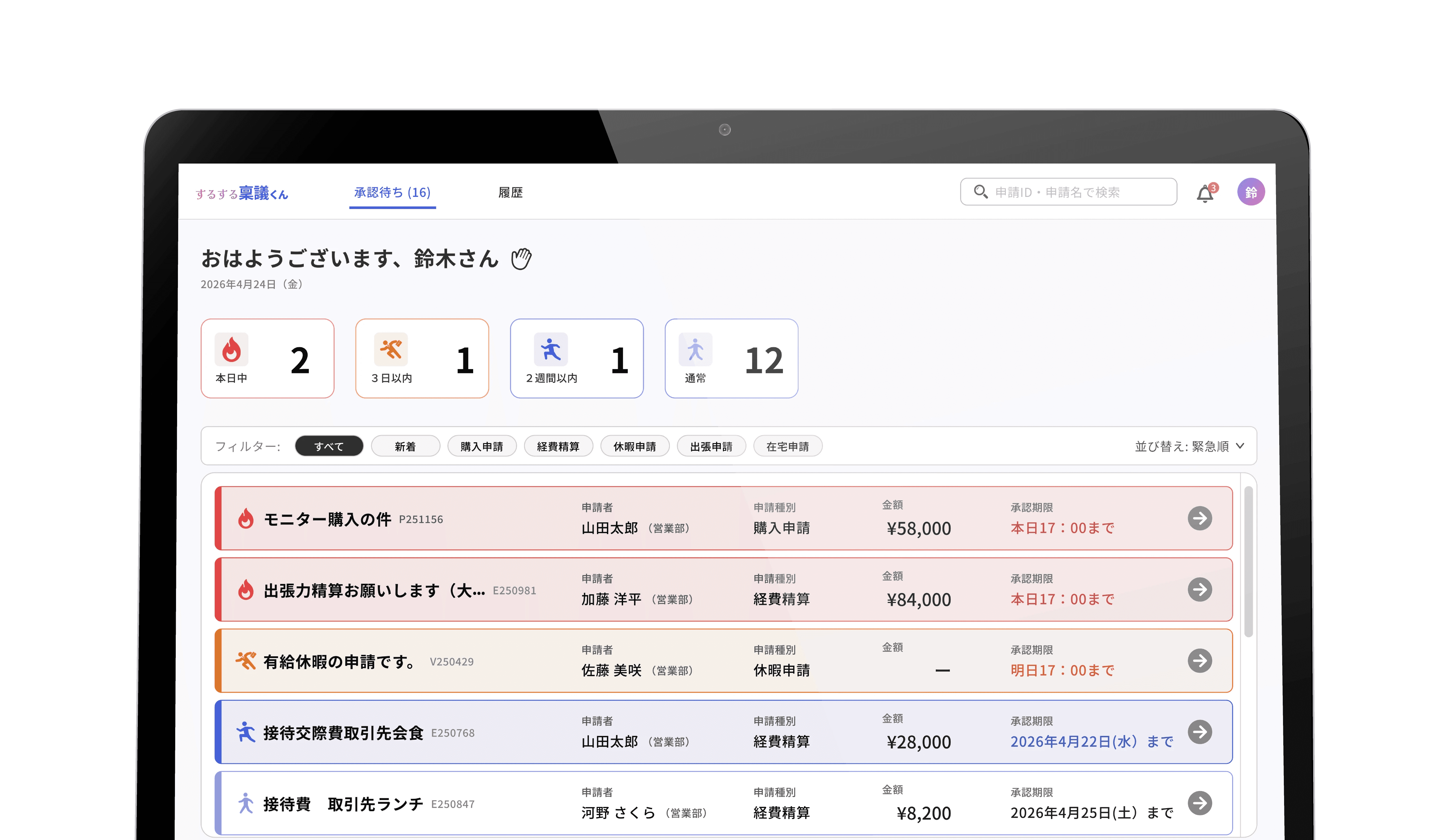
This concept case study compares the UI of a fictional internal request and approval tool, designed to reflect systems commonly built before 2010 in Japan, before and after improvements. I rethought the overly complex menu structure by consolidating similar functions and reducing the number of items. I also reorganized the information hierarchy and defined clear user steps so users can move forward without unnecessary effort.
I focused on the main interactions and how each screen relates to the others, presenting the “Before” as static images and the “After” as a limited prototype highlighting key flows.
Scope
5 key screens (Before / After)
Static + prototype
Three Key Challenges
Home Screen (Applicant View): A dashboard that shows what to do next
Before
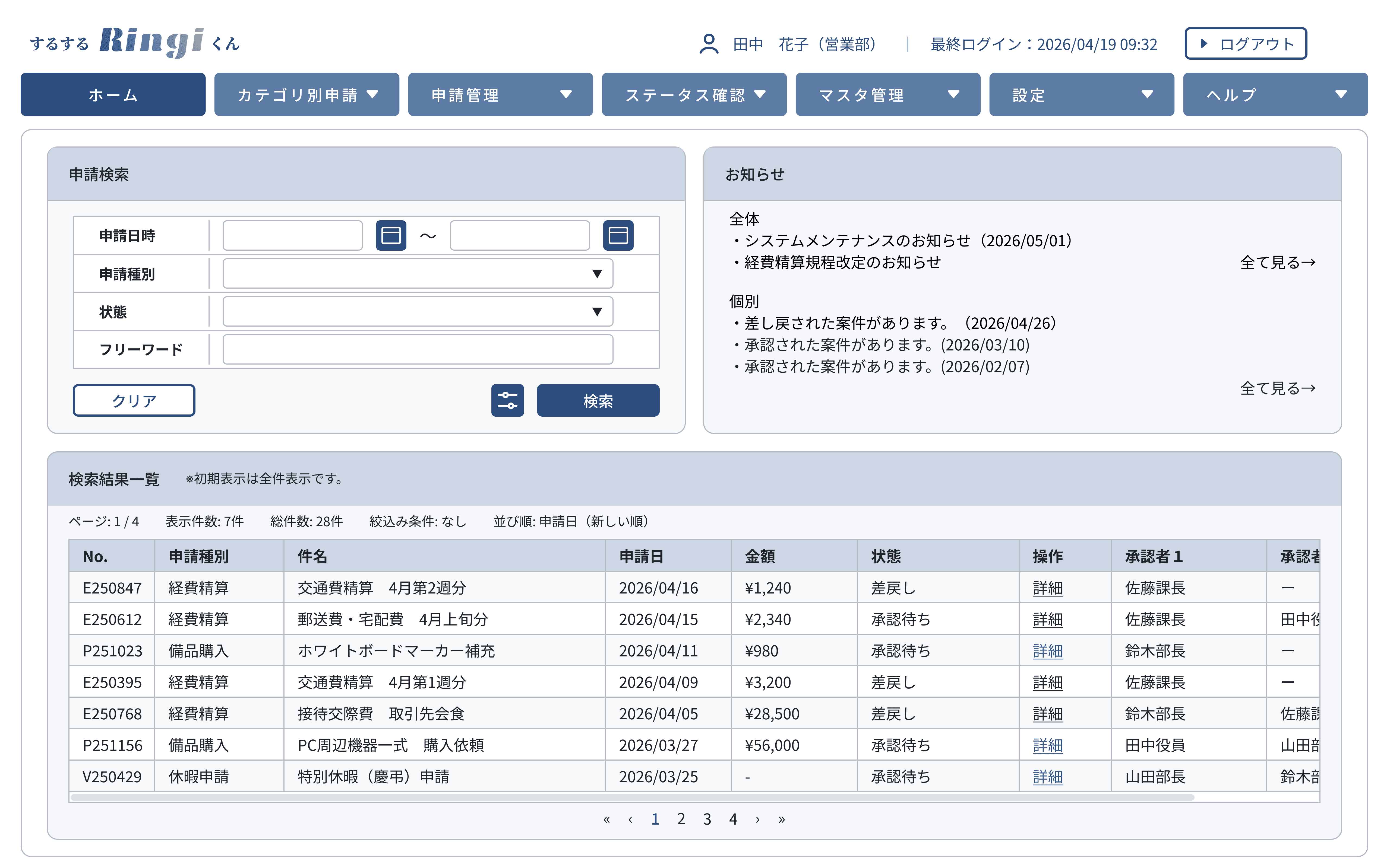
Challenges
Despite being a dashboard, the screen is packed with too much information — failing to fulfill the dashboard's core role of giving an at-a-glance view of the current state.
The global menu lists low-priority items alongside high-priority ones, making it hard to anticipate the next action
The list table has so many columns that horizontal scrolling is required to see everything
Too many low-priority metrics create visual noise
Redesigned
After

Improvements
I reframed the Home Screen as a place to surface what needs to be done now, and moved everything else one click away.
Recognizing that the app's functions fall into three groups — overall summary, managing active requests, and reviewing completed requests — I reorganized the global menu around these three categories
Asked what users most want to do when opening the app, then narrowed it down to four quick-access cards
"Recent Requests" shows only the latest 5 as cards; the rest are accessible via "My Requests" and "History"
Before/After 2
Request Detail (Applicant View): Redesigning the revision experience
Before
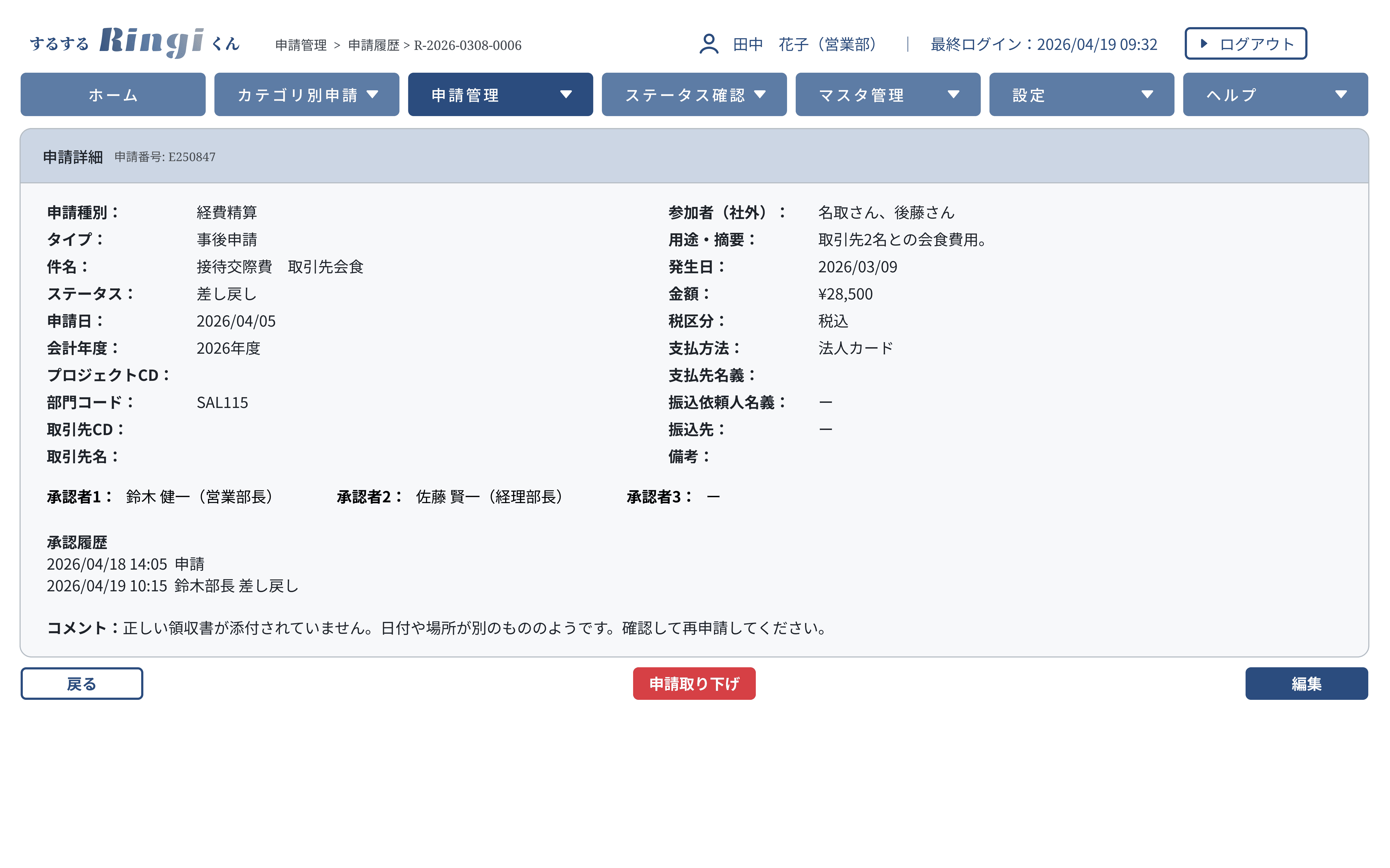
Challenges
In the original screen, request details were simply listed without a clear information hierarchy, making it slow to grasp the situation — especially when a revision was needed.
The status is buried in the screen, so it's not immediately clear whether a request has been sent back
Approver comments are consolidated into one place, leaving the applicant to guess who said what
Revision reasons are written as plain text only, requiring effort to figure out what actually needs to be fixed
Redesigned
After

Improvements
The redesign aimed for two things: the user understands the situation the moment the screen opens, and the next action becomes clear without effort.
Placed a notification banner at the top of the screen, so the revision status registers immediately upon opening
Added an approval route view that visualizes progress and the current position in the flow
Arranged comments in chronological bubble format, making it easy to follow who said what
Embedded tags within comments that, when clicked, highlight the corresponding icon on the screen
Added a reply function, so the entire exchange can be completed within the app
Other Key Screens
New Request Form: Reducing input load and keeping users motivated
Before
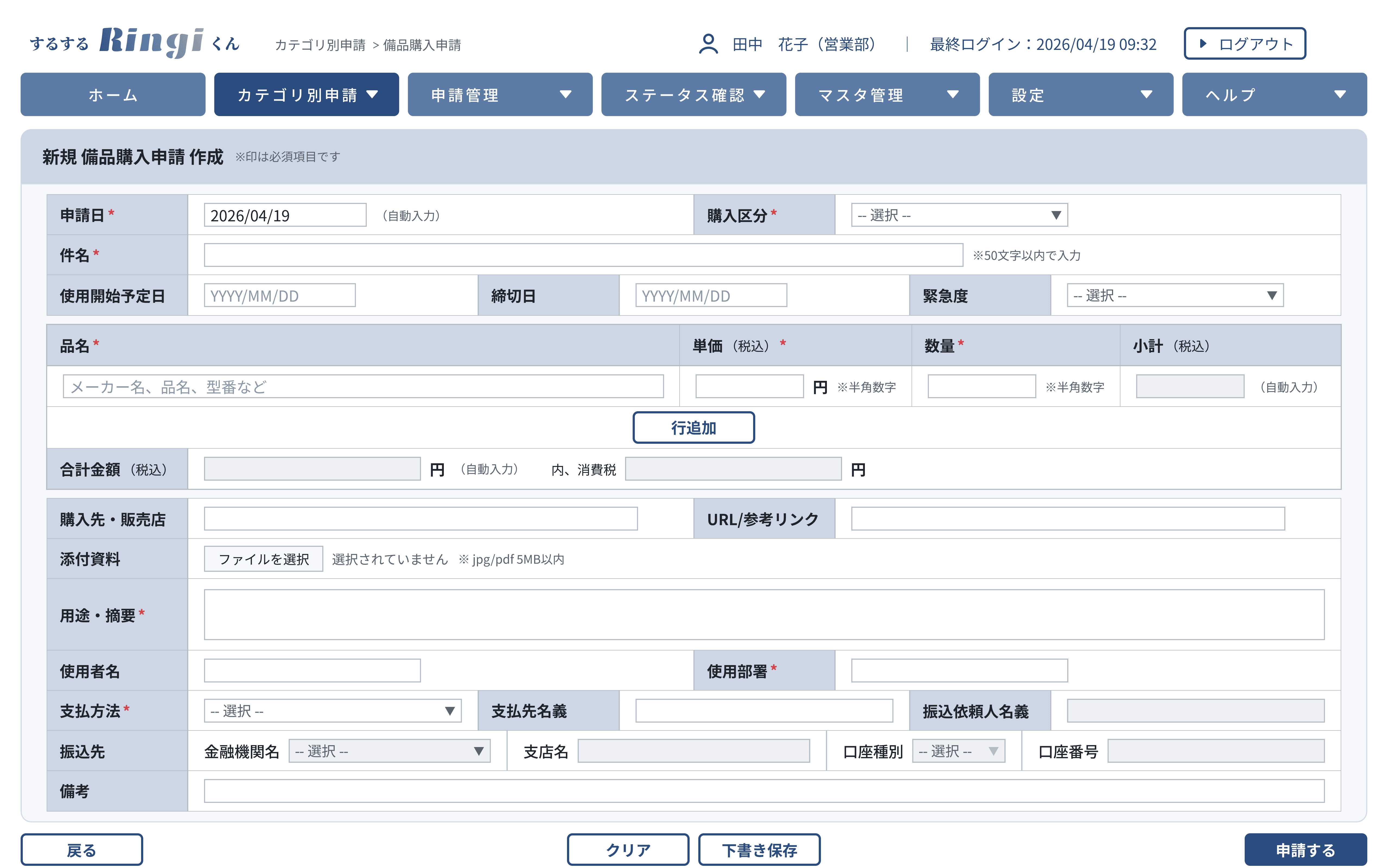
Challenges
A mechanical form with a long list of fields, daunting to anyone who opens it. The only way to convey context to the approver is a single remarks field, leaving no room for situational notes or questions.
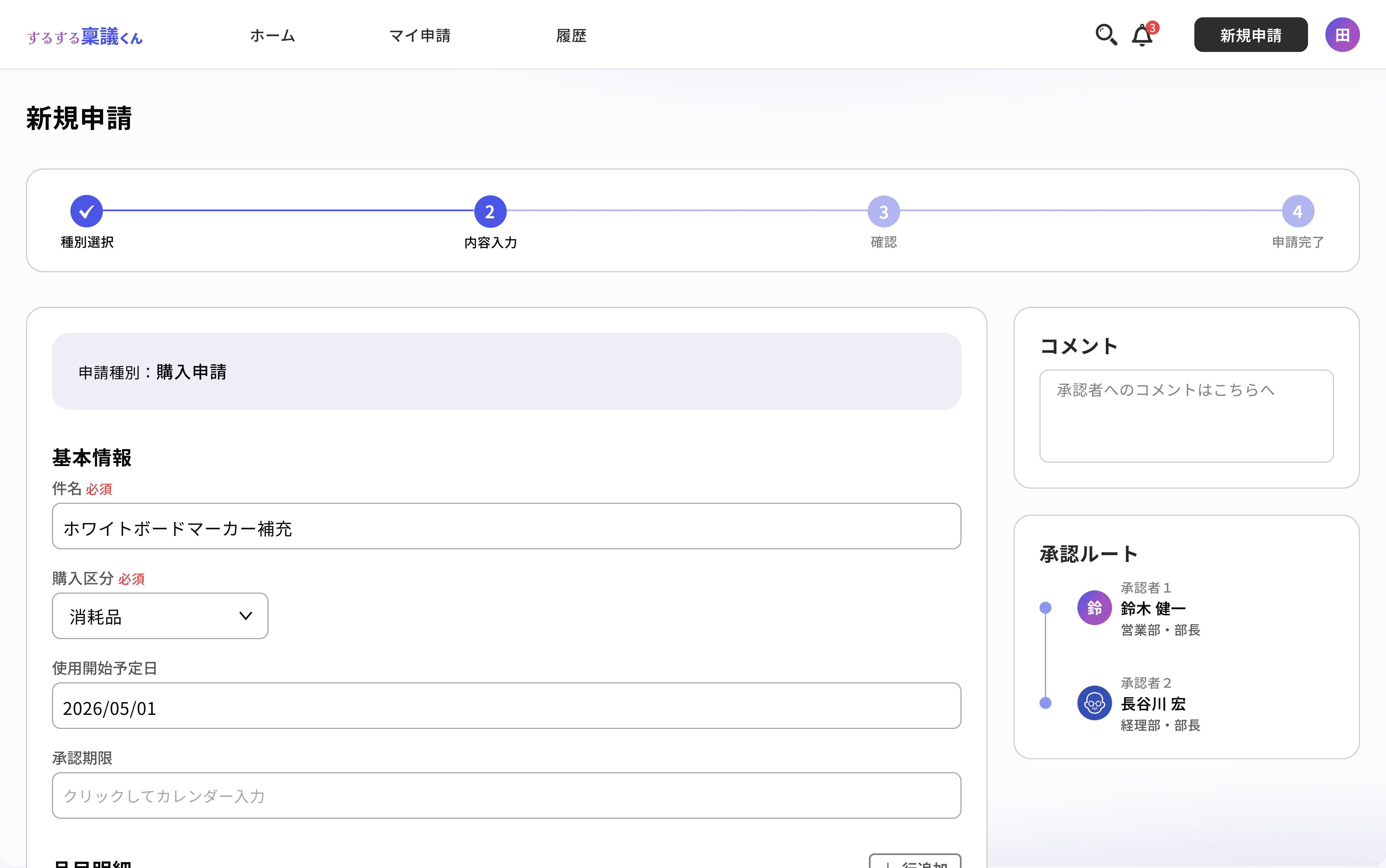
Improvements
The input flow was split into four steps, with progress visualized to reduce the psychological burden. The approval route was placed on the same screen, so applicants can visualize the process while filling out the form. A comment field was also added for situational messages to the approver at submission.
Home Screen (Approver View): A list designed to surface urgent items at a glance
Before
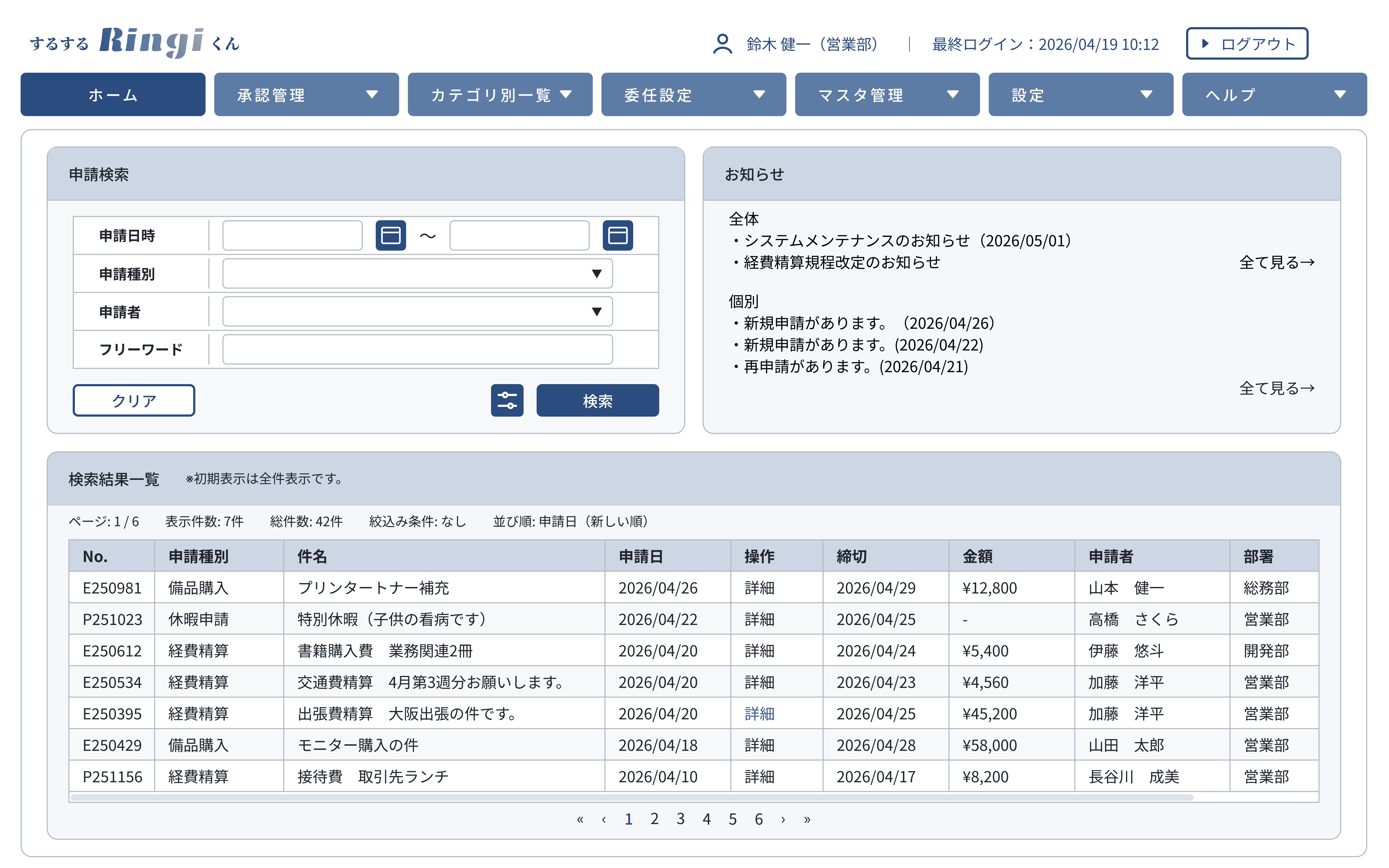
Challenges
Like the applicant's home screen, the approver's view presents seven global menu items side by side, making it hard to decide where to start. Pending requests are simply listed, leaving urgent ones buried in the queue. The "Notifications" panel announces new requests, but offers little to help judge their priority.
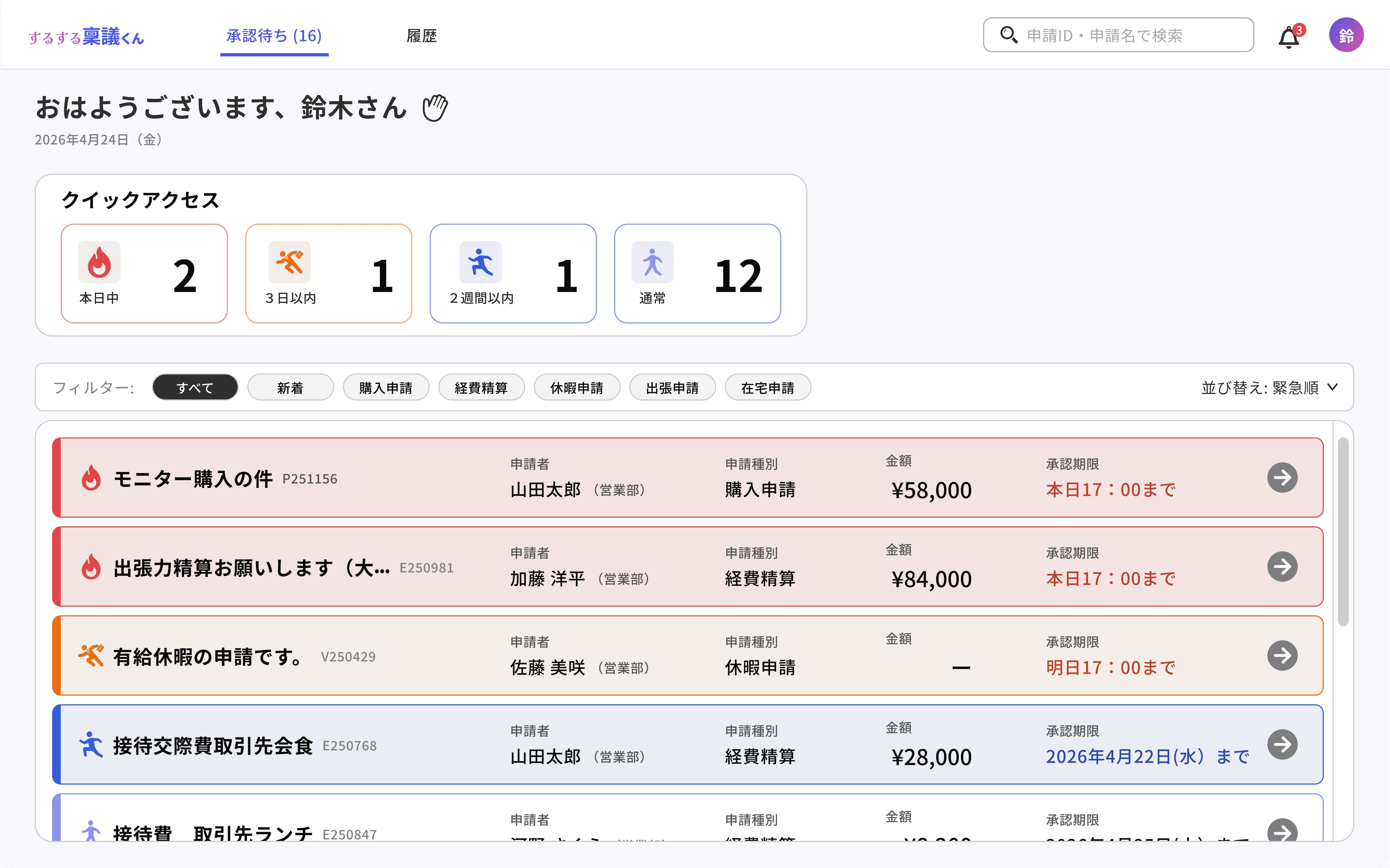
Improvements
The approver's essential functions were narrowed to two — handling pending approvals and reviewing completed ones — with other functions tucked into the top bar or icons. Four urgency-level card buttons at the top of the screen show pending counts at a glance, and the list itself can be ordered by urgency, so approvers can move directly from the overview to the requests that need attention.
Request Detail (Approver View): A UI where decisions and dialogue happen on one screen
Before
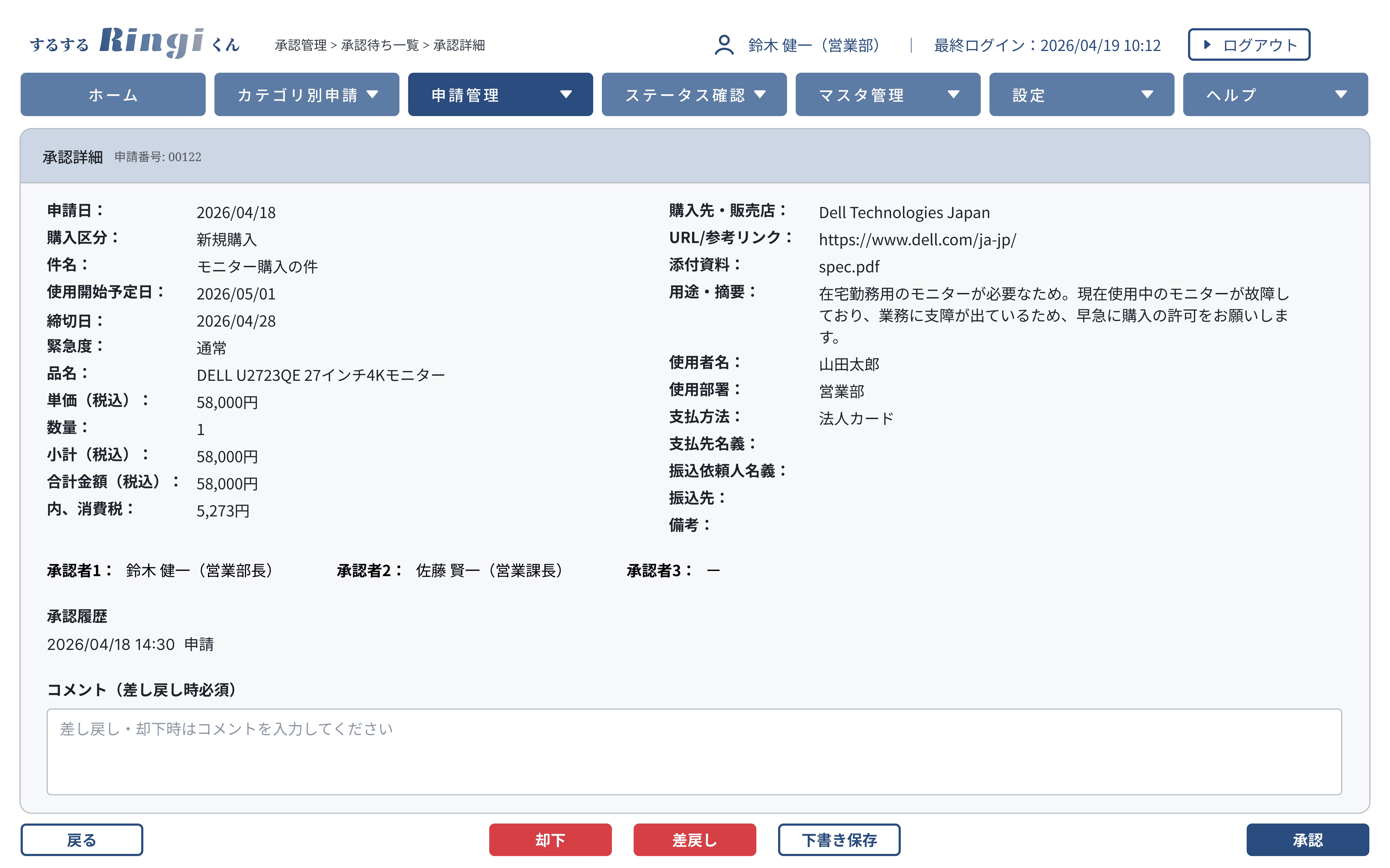
Challenges
Information the approver needs is laid out as a repetition of field name and value, making it hard to quickly grasp the gist of the request or its urgency. When sending a request back, the approver can only leave a comment — there's no way to anchor it to the specific item being addressed.

Improvements
The information hierarchy was reorganized from the approver's perspective, with key decision points — subject, applicant, amount, deadline — grouped together at the top of the screen. The comment feature was extended to link each comment to a specific icon within the request, making "what about which item" clear.
The Before screens were modeled after a system I worked with in a previous role — a tool where features had been piled on over the years, leaving the menu overflowing and functions scattered.
The redesign didn't start with reducing features. It started with prioritizing what users actually want to do with the system. Once priorities were in order, the menu shrank naturally and the flow became less cluttered. Following users closely also revealed new needs — the comment function and the ability to highlight specific items emerged from that process.
I came away with a clearer view of design itself: not just cutting, but a continuous balance of adding and removing, shaping the whole until what's needed feels in place.